


Background
When an HKU student needs mental health support, they can use Wellness@HKU—a platform designed to connect them with verified, reliable mental health resources tailored to their needs. Created in collaboration with HKU’s Social Work and Social Administration department, Wellness@HKU offers a personalised triage flow to help students navigate options that best fit their requirements. By answering a few targeted questions, students are matched with services that are accessible, trustworthy, and relevant to their wellness needs on campus.
The Problem
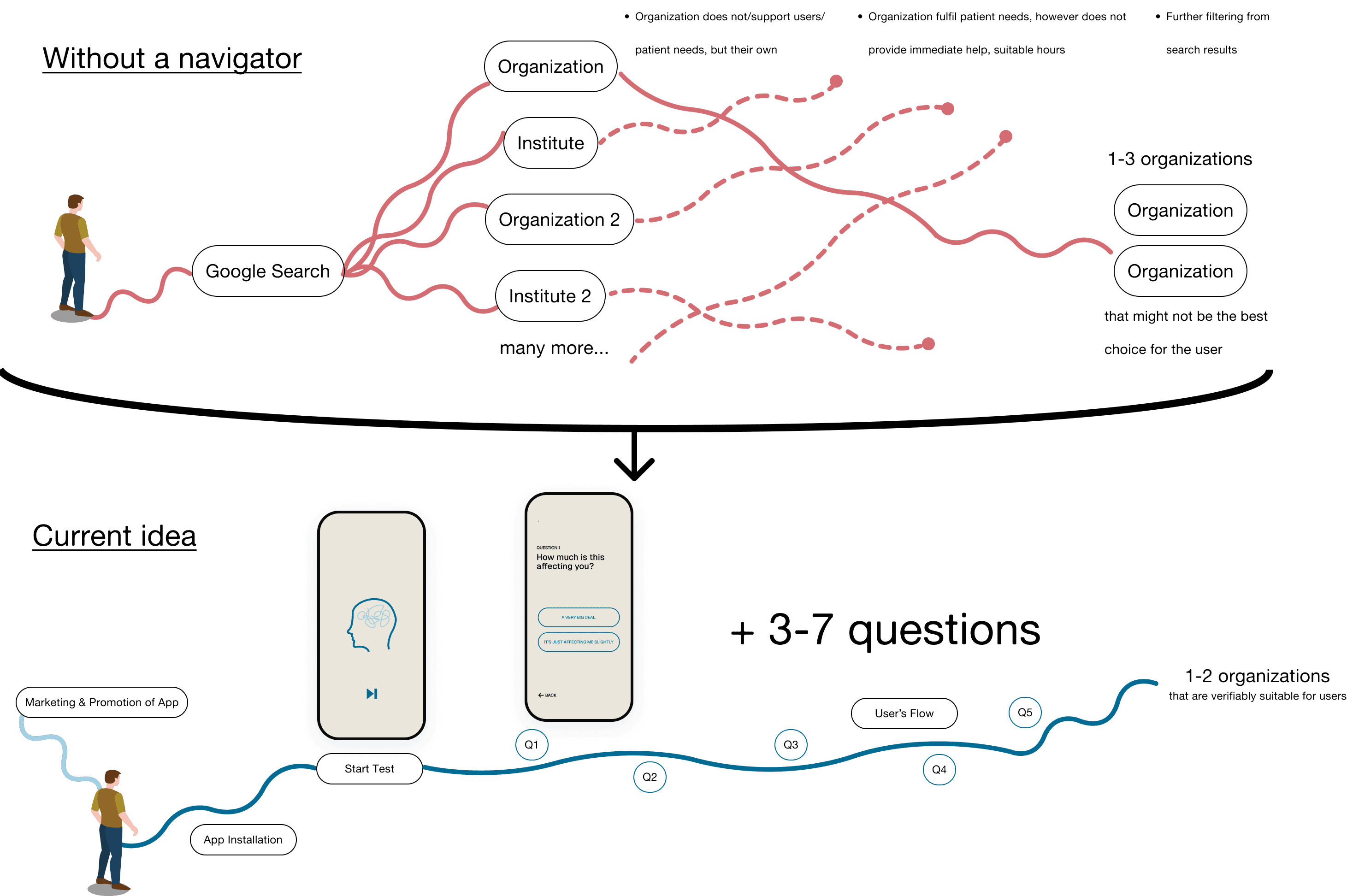
Navigating mental health resources on campus can be overwhelming and confusing for students, with direct and centralised access to the support they need. With too many mental health providers, students often struggle to find services that meet their specific needs, leading to underutilisation of available resources.
Research Highlights
48%
Young people search for mental health problems
30%
Young people experienced mental health within 5 years
To increase understanding and focus on the own campus, I have reached out to the Faculty of Social Science, and arranged an interview with Professor Gloria Wong and her team. I have noted down some current challenges and research.

Research
Affinity-mapping
After gathering feedback through interviews and focus groups with HKU students, we discovered that several challenges contribute to this problem:

Lack of Centralised Access to Trusted Resources
Difficulty Filtering for Specific Needs (Immediate Help or Off-hours Support)
Uncertainty About the Reliability and Appropriateness of Available Services
Limited Guidance in the Decision-making Process for Mental Health Support
With insights gathered from focus groups and research on other mental health platforms, it became evident that a personalised triage flow, tailored to student needs, could simplify the search process and enhance access to reliable support.
Design Goal
Provide HKU students with a centralised, personalised mental health resource navigator that matches them with trusted services suited to their needs and situations.
Hypothesis
Success Metrics
Increased number of students matched with appropriate mental health resources.
Decrease in time taken for students to navigate to a trusted service.
Positive user feedback on accessibility and ease of use of the Clarity platform.
Going into ideation, I had the following how might we questions in mind that I wanted the designs to address:
How Might We…
Provide students with a trusted and centralized platform for mental health resources that is tailored to their needs?
Create a simplified triage flow that helps students efficiently connect with the most suitable mental health resources on or off campus?
Ensure students feel confident and supported throughout their search for mental health resources, reducing the overwhelm associated with navigating options?
Product Vision and Solution
Through conducting interviews with HKU as well as hosting focus groups with current HKU students. It is seen both mental health resources as well as the situation on campus are not well received.
As service information is unclear, with it's reliability and literacy to seek help are quite uncertain. My vision is to increase personalization and encouragement while finding resources, and to ensure the accessibility of health resources can be improved by providing basic information in focused areas.
Prototyping & Refinement
To bring Clarity to life, I developed two distinct versions of the app prototype, each focusing on different aspects of the user experience. The first version emphasised a straightforward triage flow to guide users quickly to mental health resources. The second version incorporated additional personalisation and feedback features, to provide a more tailored and engaging experience.
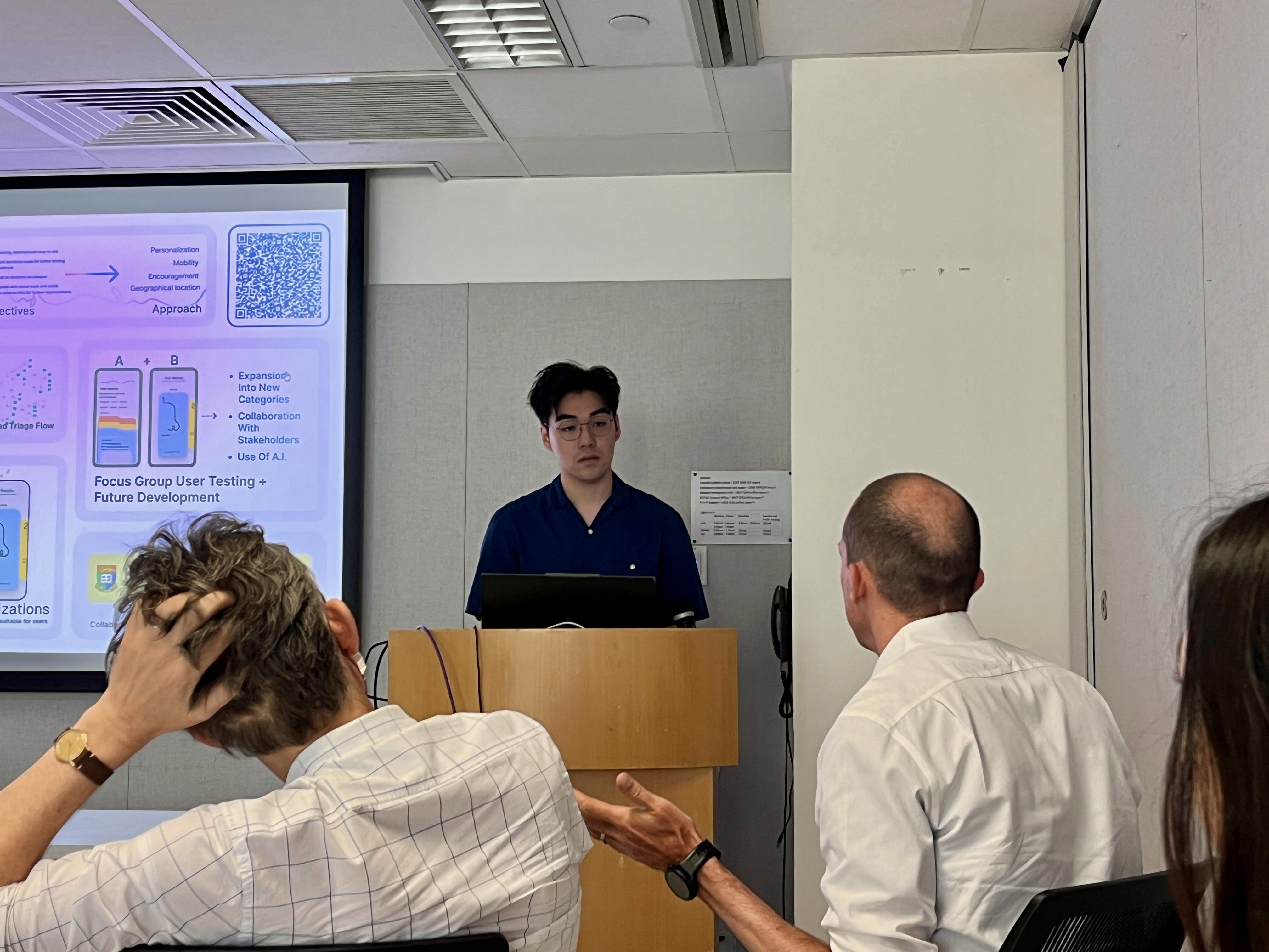
Both prototypes were presented during focus group sessions with 20 HKU students and staff. These sessions were instrumental in gathering detailed feedback about accessibility, ease of use, and user preferences. During the focus group, I also inquired about the current situation of mental health on campus:
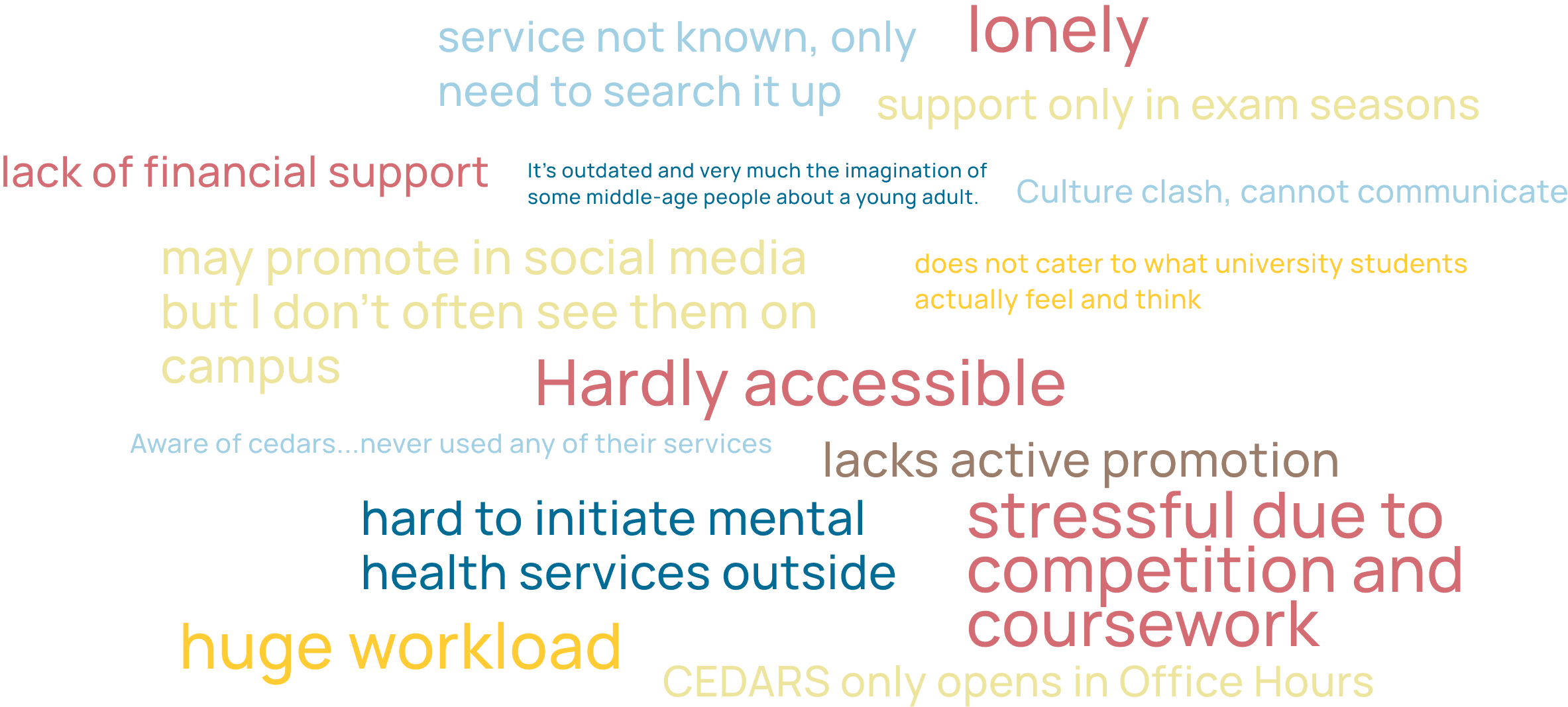
Participants appreciated the overall design but suggested specific adjustments, such as clearer navigation, improved question clarity, and more seamless transitions between steps.
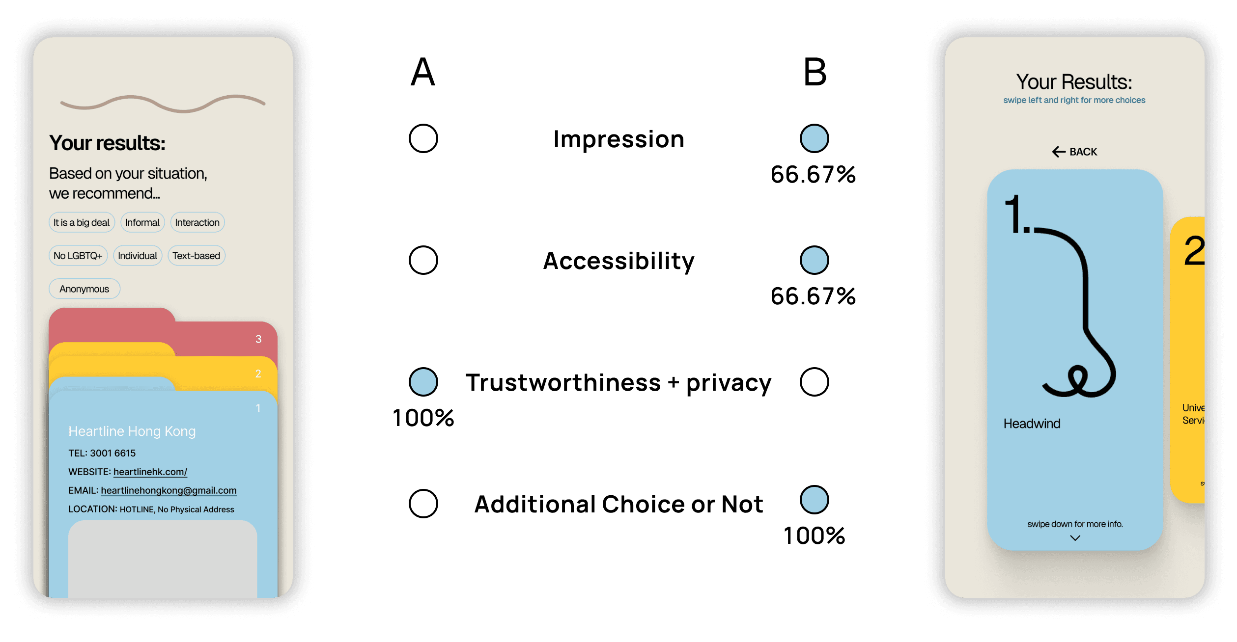
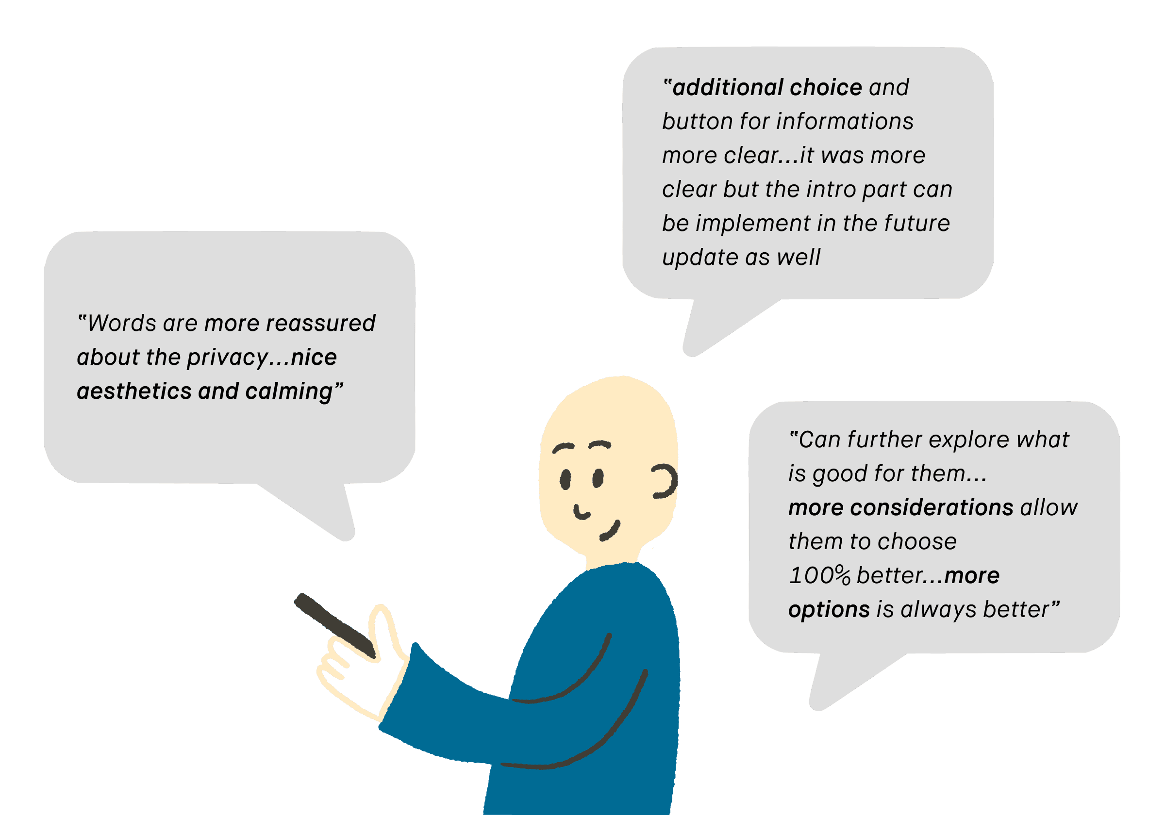
This invaluable feedback directly shaped the final prototype. By merging the best elements from both versions and addressing the focus group’s suggestions, I created a more accessible, user-friendly app that effectively meets students’ mental health needs. The final version simplifies navigation, enhances personalisation, and ensures a smooth triage flow to connect users with the right resources.
From Clarity to Wellness

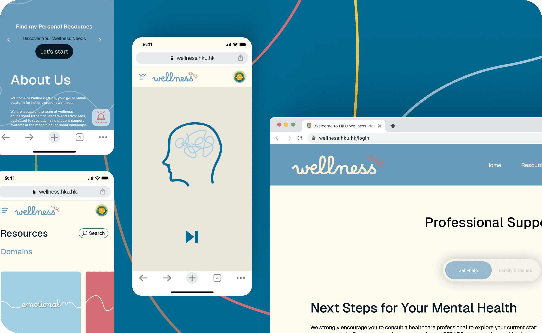
In response, HKU invested in this project, allowing me to evolve Clarity into Wellness@HKU, encompassing emotional, social, physical, intellectual, and financial well-being. Transitioning from an app to a website enables Clarity’s resource navigator to be integrated within a broader wellness framework, providing students with a centralised and accessible resource hub.
Home Page and Emergency Support
Resource Browsing

Resource Signposting (Clarity Integration)
Bookmarking and User Profile
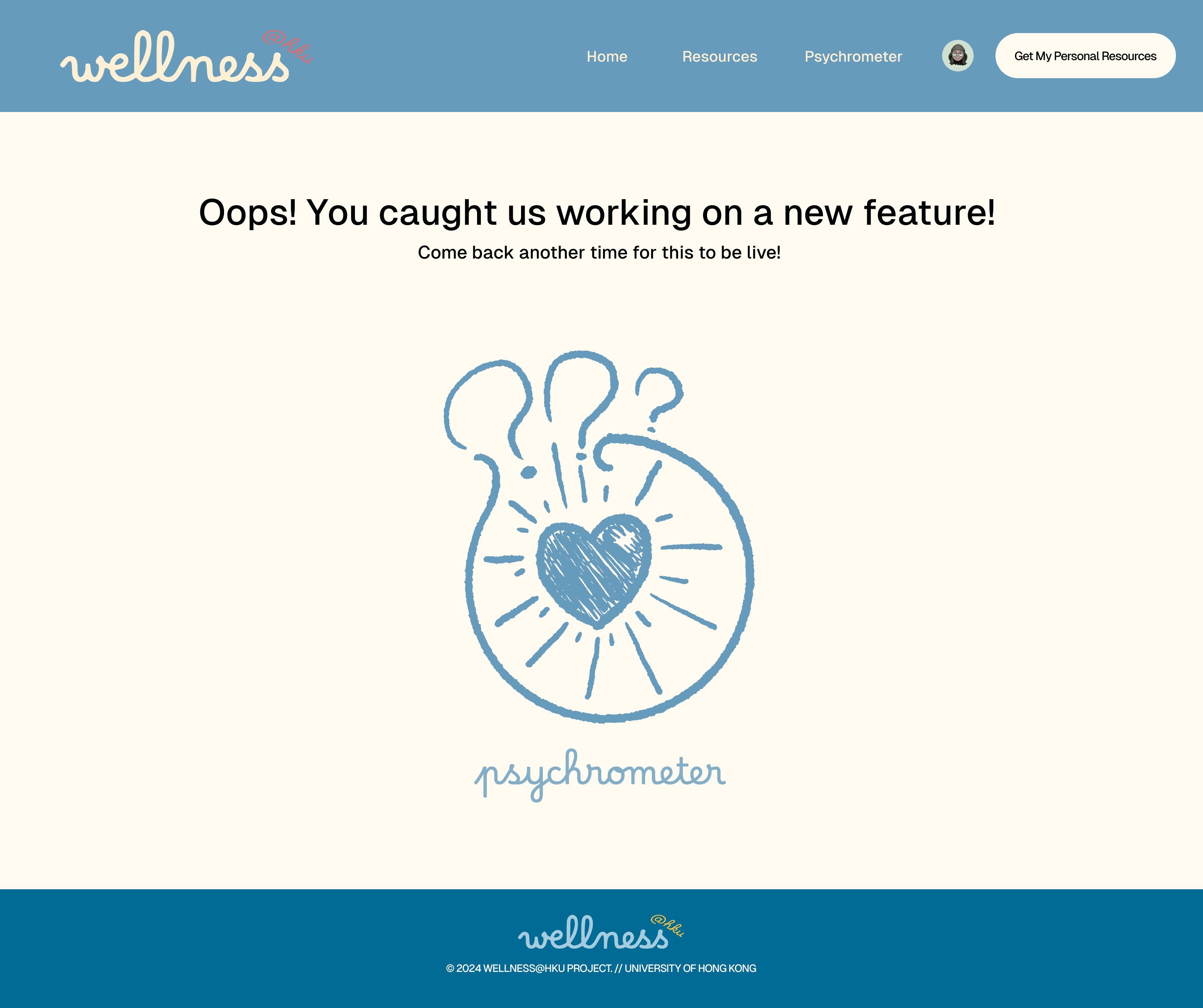
Looking Forward
In the next phase, the platform will introduce a psychrometer tool, which will enable students to assess their current mental and emotional state through a simple self-check. The psychrometer will suggest tailored resources based on the results, further enhancing personalization.
What I Learned
With phase 1 of Wellness@HKU now live, I feel very grateful to see the basic resources and the Clarity Navigator that I have made from my own final-year project, implemented into the website, providing students with an accessible starting point for wellness support. This project has been a journey of learning and growth for me as a designer but also someone who is part of the ideation of the project.
Moving forward, I’m excited about the upcoming phases, which will introduce new features like the psychrometer for tracking mental health trends. I’m also prepared to address bugs and make iterative improvements to ensure the platform evolves into a truly student-centered resource.
Collaboration is essential for phased rollouts.
Working closely with university teams, I learned the importance of clear communication and alignment on both current and future features. Involving each stakeholder early on, especially the manager and developer, ensured the smoother implementation of the Clarity Navigator into a scalable website platform.
User feedback is a continuous process.
Rather than a one-time feedback session, regular check-ins with our student users helped us identify areas for improvement and shape our updates. This iterative process is critical to creating a relevant and user-centred wellness resource on campus tailored for students.
Balancing ambition with functionality.
With a broad vision for Wellness@HKU, prioritizing core features in phase 1 kept the project achievable and allowed us to provide immediate value to students. Phased expansions will ensure that each update is well-integrated and maintains the user-friendly experience students need.